Creating basic sketches
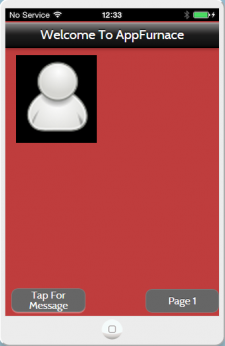
For our next project, we were given the task of creating a mobile application using an online tool called AppFurnace. I started out by creating some basic pages on the AppFurnace site, in order to get a feel for how it works. On the right in fig.1, I have included a screenshot of the first page I created using AppFurnace, it contains a banner at the top with a welcome message, and has two buttons at the bottom. The button labelled 'Page 1' simply redirects the user to Page 1 of the app, but the button labelled 'Tap For Message' runs a short piece of code when tapped.
We were given the choice of creating either a freshers app, an event app or a simple game created using Javascript. I decided to create an event app for an upcoming music festival in the Netherlands. Once I had chosen the event I would base my app around, I began to do some research in order to find out what I would need to include in my app. I searched my chosen festival (Time Warp Utrecht) and found its website, from here I found that there were 5 main areas that I needed to cover when designing my app. I had to include information about: the line-up, how people could buy tickets, ways of travelling to the festival, packages offered by the festival and also info such as FAQ's and info about ticket deposits.
Fig. 2
Above, I have included a screenshot of the code that I used for the 'Tap For Message button, I created a function named 'popupMessage' and wrote code to say that when the button was tapped by the user, the function would run and display a pop up message that said 'Hello There! A Popup Message'. The type of popup box I used when writing the Javascript was an Alert popup box, meaning that the user has to tap OK before they can continue browsing the app.
I have also included a screenshot that shows how I implemented the code to run from the button tap. I set the button's Tapped Function to the function that I had created for the popup message, meaning my function would run when the user presses the button.
Fig. 3
I have included a screenshot of Page 1 of my first app in fig.2, which has 3 buttons all running different functions. The Back button simply takes the user to the last page they visited, and the home button redirects them back to the home page of the app. The button labelled 'Tap To View Location', when tapped, takes the user to a new page which contains a map showing their real time location. This did not require any coding, as the AppFurnace site contains a map tool to allow users to find their location and navigate around by scrolling. The map is shown in fig.3 on the right.
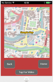
At the bottom of the page in fig. 3, I have included a button labelled 'Tap For Video' and when pressed, the user is taken to the Video page of the app, which is shown in fig. 4. On the Video page, there is a large button labelled 'Tap To View Video'. I used some coding for this button as well, to see if I could create an error message. I startex by creating another function for the popup error message, which is shown below. I named the function 'popupError' and wrote the code so that when the 'Tap To View Video' button was pressed, an error message would be displayed that said: ''Video Couldn't Be Played..''. I have included a screenshot of the error message running on my iPhone in fig. 5.
Fig. 4
Fig. 5
Mobile App Development
My next step was to start creating a design for my application, which i began by using a flow diagram to help me with the design process. In fig. 6 on the right, I have included a sketch of the flow diagram that I used. It shows that my first steps during the design process were to specify the functionality of the app e.g. what does it need to do? and how it will work, and once this was completed, the next step was to sketch the interface for my app.
Fig. 6
Fig. 7
Fig. 7 shows the first page I designed for my app, I included buttons that will take the user to various different pages including: a line-up page, tickets page, travel page, packages page & a general info page. I also included a video player at the bottom of the page, which will display a video of last year's festival. I decided to embed a video into the page as a way of incorporating different types of media into my app, rather than just having text. The top of the page also includes a banner with the name of the festival and it's logo. When designing this page, I wanted to keep the design fairly simple and minimal, and implemented this by using a kind of 'grid' layout for the buttons, which kept everything looking ordered and neat.
In fig 8, I have included a sketch of what my line-up page would look like. I decided to use a simple A-Z layout, mainly to keep with the theme of simplicity in my app, but also due to the fact that the festival I chose was only a day festival, meaning there is only one night's worth of music, and hence it wouldnt have been appropriate to use a day-by-day layout for the line-up. Additionally, since there are only 35 artists listed on the line-up for the festival, an alphabetical layout seemed more suitable, as there wasn't a massive amount of information to include.
Fig. 8
Fig. 9
In fig. 9, I have shown a sketch displaying the design for my 'Travel' page. For this page, I decided to layout the information as a series of buttons which would contain links to the festival's website. The buttons will link to information about how people can travel to the festival via a number of different methods, e.g. public transport, train, car, bus or plane. When creating this page, I implemented some coding using a function I had created called 'openUrl' which runs when one of the buttons is tapped, and works by telling the app to open a given URL in a web browser on the user's mobile device.
Fig. 1
Fig.1
Fig. 10
Fig 11 shows one of the finished pages of my app. For the travel page, I decided to include some small icons next to each button, as a way of adding some graphic elements to the page, but also in order to make the app accessible to people from a variety of different countries, as the icons are recognisable to everyone and remove the obstacle of a language barrier. I felt that was particularly relevant seeing as the festival takes place in a european country. With this page and the others, I have stuck with a fairly basic colour scheme of greys, white and black, in order to maintain a sleek and minimal looking app, whilst still being able to clearly convey the required information.
Finalising Mobile App
Fig. 11
In fig 12, I have included a screenshot of my finalised Line-up page on my app. As there was not a great amount of artists performing at the festival, I decided to simply list all the acts alphabetically on a single page. I started by using some basic text boxes in AppFurnace which I went on to customize to make them look slightly more unique, e.g. using rounded corners and removing any settings for shadows and borders, as i prefered the almost '2D' look to the boxes. It is not clear to see from the screenshot, but I made use of the 'VScrollArea' widget on this page to make the page scrollable, as I wouldn't have been able to fit all of the information on a standard page length.
Fig. 12
Fig. 13
I have shown the finished version of my Home page in fig. 13. The design was virtually unchanged from my initial sketch, mainly because I was quite satisfied with the layout that I had drawn up. I have included a large banner at the top of the page, containing the logo for the festival, which is an image I obtained from Google images. The video player at the bottom of the page contains an official video of last year's festival, and when played the video player displays a series of controls that can pause, rewind, fast forward and scrub through the video.
Fig. 14
In fig. 14, I have included the completed version of the Info section of my app. Again, even though it is not clear from the screenshot, I have made use of the 'VScrollArea' widget on this page, so that I could fit both text boxes on to the page without any content being cut off. I have also used the scrolling function on the two individual text boxes, as the FAQ section contained a relatively long list of questions and answers, and for the deposit info section, there was a lot if important infomation that the user needed to be displayed clearly.
Fig. 15
In fig 15, I have displayed the finalised version of the Tickets section of my app. The final design has been virtually unchanged from the initial sketch mainly due to the fact that I was satisfied with the way in which I had laid out the information, which I arranged a 'List' type format. I decided to use both grey and white for the text boxes on this page, in order to differentiate between the types of information being displayed, for example, I used grey for the text boxes containing info about the type of ticket and white for the text boxes containing additional info about the ticket. This page contains a button for each ticket option, labelled 'Buy Now' which also runs the 'openUrl' function and directs the user to the ticket section of the festival's website. I also chose to apply a dark-blue border to the 'Buy Now' buttons in order to convey the idea that they have a function, unlike the other boxes which only contain text.
HOME
AppFurnace
Scan above code on AppFurnace mobile version to download the app.