In this first session, we were given the task of creating a website using HotGlue, which is a tool used for creating wesbites directly in a web-browser. When creating my first site, I tried not to think about the design element too much and focused more on experimenting with the features of the website. The first thing I liked about HotGlue is the fact that it allows you to compose a range of media, such as text, images and videos all through freehand movement, and I think this element of the site makes it very user friendly, but also gives it versatility, as anyone from professional designers to people with little design experience would be able to use the website with ease.
It was clear when using HotGlue that there are a wide amount of features available to the user when creating a web page, such as the ability to edit text box colour (including hexadecimal colours), edit the typeface, style of the font, line spacing, line height etc. but also some more advanced features, such as being able to make an object appear on all pages, as well as being able to make a selected object act as a link to another page on the website.
In addition to these features, HotGlue also includes the option of embedding a variety of different media in the site, for example, you can embed links to YouTube videos, Soundcloud streams and it also supports animations such as GIF's as well. I feel that these additions to the site make it more appealing to people of a younger generation, and again increase the versatility of the site.
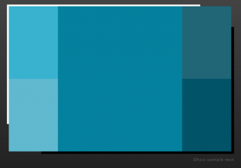
Initially, I decided to stick with the basic colour scheme that was provided with HotGlue, which was a selection of basic blues and yellows. However, during my design process for my website, I thought about what the site needed to do and one of the main things that my site needed to do was to engage with the user, and be presented in an appealing way. So I decided to design my own colour scheme for the HotGlue site, and I did this by using a website called 'Colour Scheme Designer'. On the right in fig. 4, I have included a screenshot of part of the colour scheme I chose to use. I decided to use a variety of different blues, as I felt that they were quite calm colours and would give my website a sleek look, rather than using bright colours which may end up looking garish.
On the right in fig. 1, I have included a first sketch that shows how I planned to set out my HotGlue site, I have included a week-by-week layout on the right hand side of the page, alongside sections for photos, videos & possibly animations. When sketching out this design, i tried to keep in mind the features that a good website should include, such as easy navigation, an engaging design, as well as appropriate fonts and styles.
In fig. 2 to the right, I have included another sketch which shows a developed idea of what my portfolio homepage would look like. I made some small changes from the original sketch, mainly that i had chosen to scrap the idea of using a week-by-week layout, since I felt that the website would look a lot more organised if I documented all my work by subject, whereas with the week by week layout, the project that i was documenting would change every few weeks and may look confusing to someone viewing my site.
Additionally, i had the idea that if I arranged my work by subject, I could include some element of design by including the logo of each application we used for each individual project e.g. HotGlue, AppFurnace & Processing, and would add to the visual appeal of my site.
Evaluating HotGlue
After having created the initial ideas for our HotGlue sites, we were given the task of reviewing HotGlue. We did this by splitting up into groups and discussing our thoughts about the site. Personally, i thought when using HotGlue that it was a very useful tool, not just for web designers, but also for people who want to take their first steps into web design, particularly the drag and drop interface, which means it is not necessary for people to have to have any previous knowledge of coding i.e. HTML but still allows them to create something that looks good and functions well. Although no knowledge of coding is needed, HotGlue still allows people to edit code for individual pages on the site, increasing the appeal of the site for more experience web developers.
I did have a few problems with HotGlue in general, which are mainly small nuances such as: the fact that there is no undo or redo options included, and while I didnt necessarily expect these functions to be included, it could affect users who are used to having these options available to them in programs such as word processors or other software. Another thing that bothered me when using this site is the fact that there is no explicit way of showing that your work has been saved, and whilst I eventually figured out how the saving works on the site, again it could be confusing to people who haved used programs that have a 'Save' function that is clearly displayed.

In fig. 3, I have uploaded a screenshot of a spreadsheet containing info about how we reviewed the HotGlue site, as shown we reviewed the site based on a number of different factors, such as; the platform the site was viewed on, the browser used to view it, the screen size etc. When we reviewed the site on a desktop computer, there were very few issues, as viewing it on a desktop meant that the text was clear and easy to read and all the content was fitted to full screen size. However, when we reviewed it on a mobile device, we found that the text was somewhat smaller and more difficult to read and the size of the media that we had inlcuded had been scaled down. In addition, when viewing the site on a mobile device, any GIF's that we had included were not functioning. In this sense, the versatility of HotGlue could be improved, as it is only designed to function properly on a desktop computer or laptop.
Creating basic sketches
The next process I carried out was creating a scope for my portfolio that would be created using HotGlue, I had to think about the needs of the website and what it needed to do, as well as the needs of the user and how to design the site so that it clearly showed what the site was trying to achieve. When doing this, I considered a number of different factors including: the content, fucntionality and presentation.
SCOPE:
What does it work on? --- My website should be designed to function on desktop computers/laptops mainly, but should also be able to fucntion well on mobile devices in order to increase the versatility of the website.
Who is it for? --- The website is going to be designed for my course leader to use and review, and hence should be easy to naviagate through, contain an appropriate range of media and should display all the content covered of the course of the semester.
CONTENT:
What is in it? --- My portfolio will contain documentation related to the work completed in class, such as the processes I went through to create specific content (e.g. initial sketches, flow charts, rough notes), any problems I encountered during the design process (and how I fixed these problems) and should include my final designs, including annotations & notes.
FUNCTIONALITY:
What things does it do? --- My portfolio should be able to clearly display the processes I have used to complete my work, it should also be able to navigate through a series of pages (ex. via hyperlinks) that all contain different content, and should be able to display a range of media such as text, videos, pictures, animations etc where necessary.
Developing a site in HotGlue
After selecting a range of blues to use in my website, I decided to also use a colour that would complement the ones I had already chosen, and to do this I used a website called 'Paletton.com'. This website allowed me to enter the hexadecimal code of one of the colours I had already used, and would then show me the colour that complemented the original, along with the hex code for the new colour. Once I had obtained these hex codes, I used the text box colour feature in HotGlue, and by 'Shift Clicking' this option, I was able to enter the six digit hex code I chose to use, which is shown in Fig. 6.
Fig.1
Fig.2
Fig.3
Fig.4
Fig.5
Fig.6
HOME
In fig 7, I have shown the finished version of my home page on HotGlue. The information is laid out in a 'grid' type of format, which I purposely chose in order to give the website a good structure and to increase the ease of navigation through the site. I chose to arrange my work by subject, as I felt that this would help keep my work organised, rather than having the documentation spread out across a week-by-week layout. I also decided to get rid of the 'Video' section of my homepage that I included in my first sketches, as I only ended up including a small amount of videos in my portfolio and felt it would be unnecessary to include a seperate section for videos.
Fig.7
HotGlue